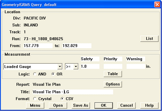
Besides the tabular report, results of the tie planning budget calculation can also be viewed graphically. Unlike other reports, the default setting for the Visual Tie Replacement plan is designed to view tie replacement on a run basis, rather than on a track, subdivision or division basis. In order to prepare a Visual Tie Plan, a Visual Tie Plan Calculation must first be performed. The Visual Tie Plan Calculation window is found under Reports / Visual Tie Plan Calculation. The settings in this window default to the Division, Subdivision, Track and the From and To mileage of the selected run.
If desired, a different run may be selected from the List opposite the run number. The Tie Planning Budget Report Options window also appears in this query/calculation. The Tie Replacement plan that is generated from this report will be based on the selected options. Each report can be given a unique name, relating to the run number, date, Subdivision, mileposts, etc.
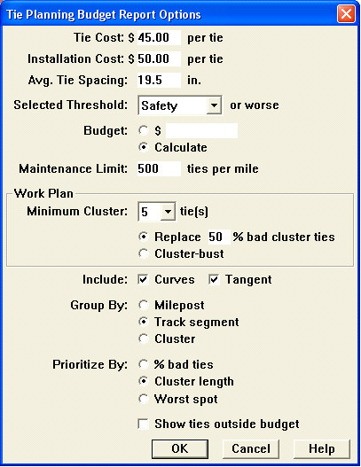
When this report file is written, another file with the same name and the extension .TIE is also written. The TIE file can be displayed as Visual Tie Replacement chart.
Take the following steps to create a Visual Tie Plan:
Visual Tie Plan
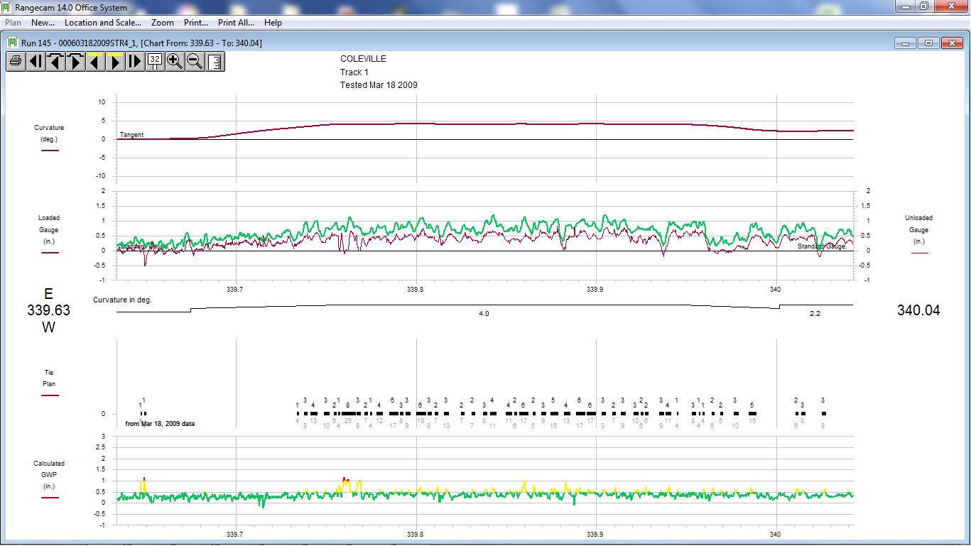
Bad tie clusters appear as solid black rectangles if they are within budget, or hollow grey ones if they are outside the budget. The required number of replacement ties appears above each cluster; the total number of ties in the cluster appears below. (The numbers are staggered vertically to avoid confusion when clusters are close together.)
In this case, the exception levels defined for gauge widening projection in the query used to produce the tie plan were the same as the exception levels defined in the threshold table. Bad ties were defined as 'priority' level or worse. Thus, there is a close correspondence between the tie plan and areas in the chart where the gauge-widening projection goes above the yellow (priority) exception level. Ties in this curve, which includes multiple clusters with ties selected for replacement, are included in the budget.
This chart behaves like the Segment Condition Chart, but has additional navigation buttons.
![]() Previous Bar Displays the previous screen containing plan data.
Previous Bar Displays the previous screen containing plan data.
![]() Next Bar Displays the next screen containing plan data.
Next Bar Displays the next screen containing plan data.
The Print All menu pick allows you to print the entire plan - i.e. all chart pages that can be reached by navigating with the ![]() and
and ![]() buttons. Selected page ranges can be printed.
buttons. Selected page ranges can be printed.