The title of the Rail Wear Trend Chart identifies the curve or tangent section by subdivision, track and mileage range.
The subtitle shows the dominant rail type on each side, and the percentage of the track segment that it makes up. This information is derived from the rail inventory calculation for the latest run included on the chart. If it has not been calculated, the subtitle will not appear.
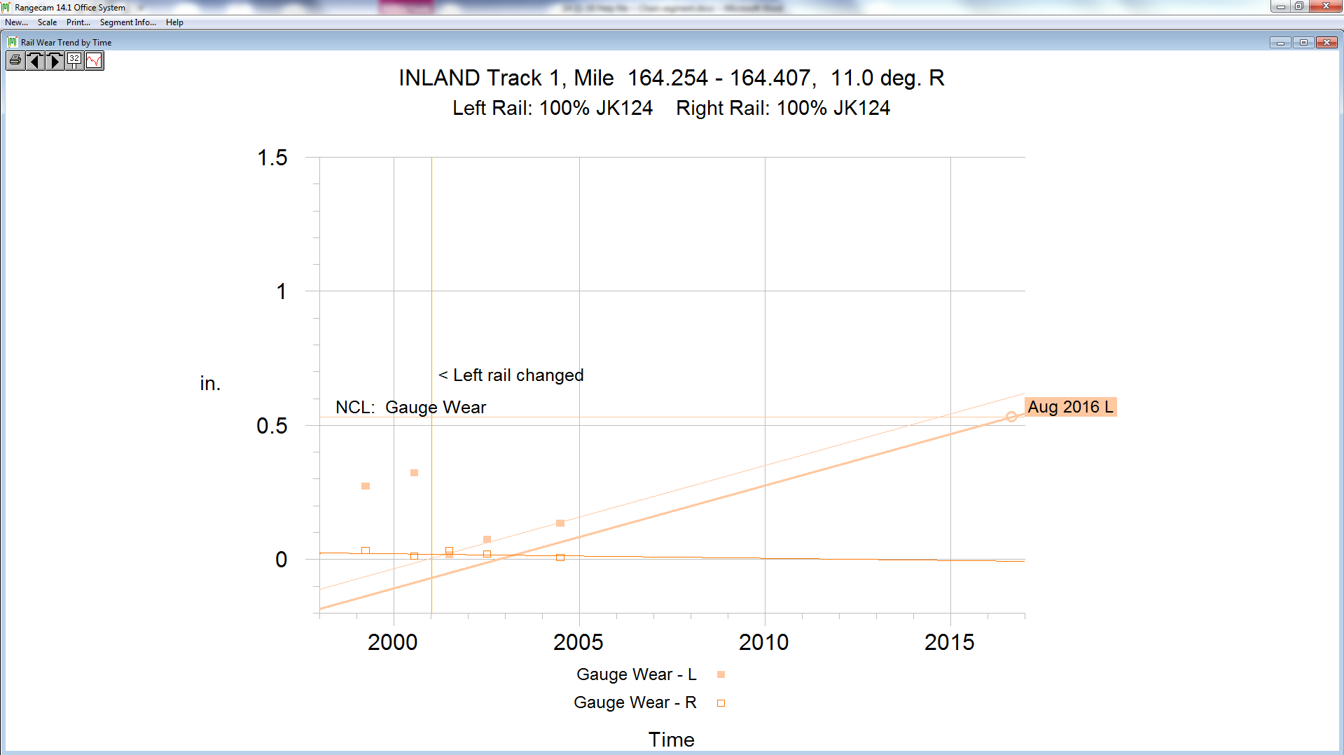
Rail Wear Trend Chart (time scale)
The example shows the wear trend for gauge wear plotted linearly for the high rail of an 11-degree right-hand curve, by time. There are five data points shown (two before left rail was changed and three after the rail was changed). Each point represents the average gauge-face wear from one data collection run. The horizontal axis shows time. In the example, the fine line shows the wear trend against time, projecting when the rail will be worn to the specified changeout limit. The colored line parallel to the average wear trend line shows when the rail should be changed to meet a specified replacement condition, such as project to 70% of the near condemning limit in the chart setup. The actual date (month and year) at which the rail in this segment will meet the changeout limit is also shown on the chart. Note: Any projected date that falls below the minimum date (shown on the y axis) is displayed in red at the bottom of the chart.