The Chart Window displays charts of rail and track measurements.
When the OK button of the Track Condition Chart Setup dialog is clicked, Rangecam begins to calculate and display the charts. The time this requires will vary depending on the total distance to be charted, the density of the data (records per mile in the database), and whether or not comparison runs are selected. It may take from a few seconds to several minutes.
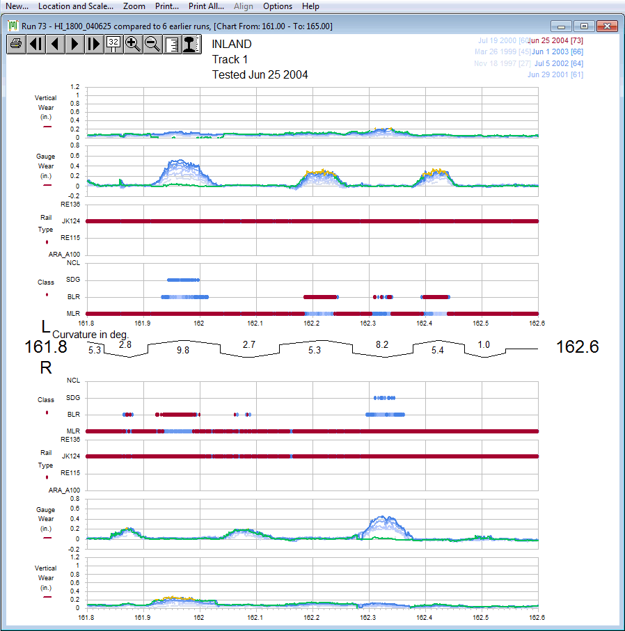
Chart showing vertical and gauge-face wear, rail type and classification for multiple comparison runs.
The main data series plotted on each chart belongs to the main run selected from the Run menu. If one or more comparison runs have been selected, their data will also be plotted. Main and comparison values are plotted in the same colors used to display them in the Profile View Window. Colors are defined in the Profile Display dialog. Multiple comparison runs are displayed in tints of the comparison color, the oldest run showing as the lightest tint. Their dates and numbers are shown in the upper-right corner. Clicking on one of the comparison runs makes it into the 'main' (selected) run, indicated by a color change. Changing the selected run allows you to edit any of the runs displayed without leaving the chart window.
This example uses the 'mirrored' layout, with data from the left rail (facing the direction of increasing mileage) in the upper half of the screen, right-rail data in the lower half. If track segments have been recorded for the selected section of track, a track curvature chart is displayed in the middle. A right-hand curve is represented as a line above the center-line of this chart, with angled corners turning down representing spirals, and the degree of curvature appearing below the line. A left-hand curve is shown below the center-line, with the degree of curvature on top. A tangent section is represented by a straight line in the middle, joined to adjacent curves by square corners.
Just below the curvature chart, if requested, track points are displayed as icons.