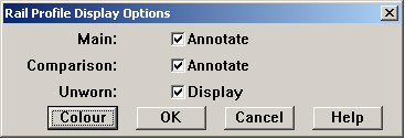
The Rail Profile Display Options allow you to set display colors and turn measurement annotations on or off for rail profiles.
The Annotate check boxes turn displayed measurements on or off for the main and comparison runs. The unworn profile overlay can also be enabled or disabled. The Color button is used to change display colors for each type of profile. It opens the Rail Profile Colors dialog:
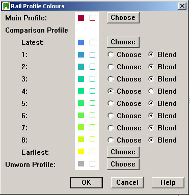
Rail Profile Colors dialog
Use the Choose buttons to specify colors for the main (selected run) profile, latest and earliest comparison profiles, and the unworn rail profile. Comparison profiles between the latest and the earliest may be chosen or blended.
The purpose of blended colors is to give a visual clue as to how far in the past a given comparison run happens to be. Earlier versions of Rangecam showed all comparison runs in blended colors, ranging from the user-chosen color for the latest comparison run to a light tint of the same color for the earliest comparison run. This fulfilled the intention of encoding the time dimension in color, but had the disadvantage that it was often difficult to see the contrast between two comparison runs that were not widely separated in time.
The current approach offers the advantages of blending, but more flexibility in defining contrasts. Any intermediate comparison profile color may be either fixed or blended. In the above example, the user has chosen a mid-green for comparison profile 4. Comparison profiles 1, 2 and 3 have been allowed to blend between the navy-blue color of the latest profile and the green of profile 4. Yellow has been chosen for the earliest comparison profile, and profiles 5, 6, 7 and 8 are blended. This scheme uses hue as well as brightness to indicate how far in the past is a given comparison run. You could use a color spectrum scheme (rainbow), a warm to-cool color scheme, or simply shades of grey. (If you use grey, you may want to change the unworn rail color.)
Click Choose to select a specific color for an intermediate comparison run, or Blend to calculate a blended color. We recommend experimenting until you come up with a color-coding scheme that combines adequate visual contrast, a suggestion of temporal sequence, and pleasing aesthetics.