The Track Segment Performance Chart shows rates of rail wear, gauge widening, and change of cant and gauge face angle in selected curves and tangent sections. The chart may be used to identify the worst and best performing curves in a territory at a glance, and to analyze the causes of variation in wear rates. It may also be used to compare the overall performance of one territory with another, and to determine whether degradation trends are, on average, getting better or worse. To run the Segment Performance Chart, select Reports/Segment Performance... from the Profile View menu.
Options for the chart are entered through the Track Segment Performance Comparison Setup dialog.
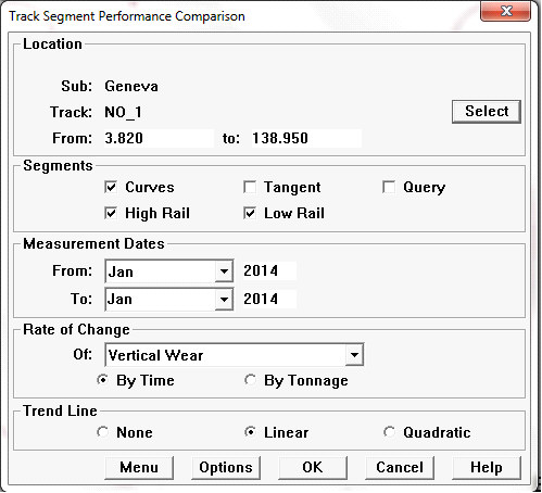
Track Segment Performance Comparison dialog
This dialog is used to select the track segments to include, the time period of included measurements, the type of degradation to be analyzed, and analysis options. The chart can compare degradation rates based on time or tonnage. It can also fit a linear or quadratic equation to the data points, showing an overall relationship between degradation rate and degree of curvature.
Division, subdivision or part of a subdivision is selected using the Select button with the Location dialog. All subdivisions in the selected division may be included. Choosing <All Divisions> includes all territories in the database possibly very time-consuming! Specifying track code and mileage range is also optional.
The Segments group allows you to restrict the chart to curves or tangent segments, or to include both. Or, if the Query box is checked, the Track Segment Query Dialog opens, allowing you to select segments according to a wide range of criteria (see section The Track Segment Query). High Rail and Low Rail boxes allow you to include high rails only, low rails only, or both.
In the Rate of Change group, you select the measurement whose rate of change you want displayed, and whether rates should be calculated by time or by tonnage. Rates of area head loss, vertical wear, gauge face wear, combined wear, track gauge, net gauge and gauge face angle are supported.
Finally, you may include an optional trend line, either linear or quadratic, showing the overall relationship of wear rate to track curvature in the selected segments.
The Menu button at the bottom left is used to add the currently specified options as a template to the Reports menu on the Map window.
The Options button opens the Segment Performance Comparison Options Dialog.
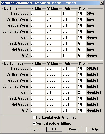
Segment Performance Comparison Options Dialog
This allows you to define vertical axes for each of the supported measurements. Axes are defined independently depending on whether wear rates are calculated on a time or tonnage basis. You may also associate gridlines with the major unit on either axis or both. For this chart, vertical axis gridlines (horizontal lines from the major unit marks on the Y axis) are recommended.
The Style button allows you to define the color and shape of the symbols used to represent wear rates for high and low rails.